
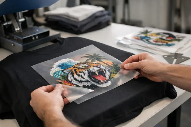
dtf transfers placement guide. A transfer can be printed perfectly and still look wrong once it is worn. A design that sits 30 mm too low, drifts off-centre or disappears into a hoodie pocket line will quickly affect the perceived quality of the finished garment. This DTF transfers placement guide gives garment decorators practical reference points for producing consistent, professional work across common apparel styles.
Placement is not just an aesthetic decision. It affects customer approval, repeat orders, production speed and waste. When each operator uses the same reliable reference points, a busy print room can maintain quality from the first garment of the day to the last.
Start with the garment, not the transfer
Do not position a DTF transfer by simply measuring from the edge of the platen. Garments vary in neck size, shoulder shape, fabric stretch and construction, while a heat press platen may not show the true centre of the item. Instead, lay the garment naturally, smooth it without stretching it and use the neckline, centre crease and key seams as your references.
For a front print, create a light vertical fold from the centre of the collar down through the body. This identifies the garment centre line. A horizontal reference can then be taken from the lowest point of the collar, rather than from the top edge of the fabric. On hoodies and sweatshirts, check that the hood, drawcords and thicker seams are clear of the pressing area before committing to placement.
Pre-pressing for a few seconds helps remove moisture and creases. It also makes the fabric easier to align. The exact press setting will depend on the transfer film, adhesive powder and garment material being used, so follow the specification for your production system rather than applying a single setting to every job.
DTF transfers placement guide for front prints
The standard full-front print is usually positioned with the top of the design around 75 to 100 mm below the collar on adult T-shirts. The best distance depends on the garment size and the height of the graphic. A tall design may need to sit slightly higher to avoid looking low on the torso, while a small central graphic can sit a little lower without losing balance.
For most adult garments, a full-front image between 250 and 300 mm wide gives a commercial, wearable result. A large 300 mm-wide design will not suit every small garment, however. Scaling the artwork down for smaller sizes is often preferable to forcing one oversized transfer onto every item in an order. This is especially relevant for retail-quality clothing, where proportion matters as much as print sharpness.
Centre chest designs should be centred on the vertical fold and positioned high enough to read clearly above the natural curve of the chest. A common mistake is to judge placement while the T-shirt is lying flat, then find that the image appears low when worn. Folded samples or fit checks on representative garments can prevent this issue on new product ranges.
When printing ladies’ fitted garments, avoid treating the placement as identical to a unisex tee. The print may need to be slightly narrower and placed with greater care around shaping seams. The aim is a design that looks intentional when the garment is worn, not merely centred while it is flat on the press.
Left chest and pocket-area prints
Left chest placement needs precision because small shifts are obvious. As a general working position, place the centre of the transfer approximately 75 to 100 mm from the centre line of the garment and around 75 to 100 mm below the shoulder seam or collar point. The exact position changes with garment size, collar style and the dimensions of the logo.
A left chest logo is commonly 75 to 100 mm wide for adults. Larger logos can work for workwear and promotional clothing, but should be tested on the garment before running a full batch. On actual pocket garments, keep the transfer clear of the pocket edge and any thick construction. Pressing across uneven seams can reduce adhesive contact and leave a less durable result.
Rather than relying on a fixed measurement alone, use a placement template for repeat jobs. A simple marked sheet or alignment tool speeds up production and gives every operator a consistent starting point.
Back prints need a higher starting point
Back prints often look best when placed higher than expected. For a standard upper-back design, position the top of the transfer roughly 75 to 100 mm below the collar. This creates a balanced print across the shoulder blades and avoids the low-back appearance that can make even a well-designed graphic feel misplaced.
Large back prints are popular for events, workwear and branded merchandise. Before pressing, consider the garment’s intended use. A large design on a lightweight fashion tee may feel different from the same transfer on a heavy hoodie. DTF transfers remain flexible when correctly applied, but print size, artwork coverage and fabric weight all influence comfort.
For a back neck print, keep the design compact and centred beneath the collar. These prints are often used for a logo, website detail or internal branding. Check that the transfer does not sit into a ribbed neckline or across a raised seam, as this can compromise even pressure.
Sleeves, legs and difficult areas
Sleeve prints can elevate a garment, but they require a different approach. Centre the transfer along the sleeve length and make sure the fabric is flat on the platen. If the sleeve seam creates an uneven surface, use a smaller platen, pressing pillow or suitable heat press accessory to keep the print area level.
On short sleeves, a logo or graphic normally sits between the shoulder seam and the sleeve hem, with enough room around it to avoid a crowded appearance. On long sleeves, measure from the shoulder seam and maintain a consistent distance across the batch. If the artwork runs vertically, check its orientation before every press. This sounds basic, but reversed or misaligned sleeve graphics are a costly and avoidable production error.
For joggers and other legwear, placement depends on the intended style. A small logo near the upper thigh is common, while a vertical leg print should follow the line of the garment when worn. Avoid pressing over pockets, zips, heavy seams or areas where fabric layers create a height difference.
Caps, bags and other shaped products need dedicated accessories and test presses. The challenge is not only alignment but also achieving full, even pressure across a curved or padded surface. For commercial production, using equipment suited to the product is more dependable than trying to adapt a flat platen beyond its practical limits.
Build placement into your production process
Consistency comes from process, not from an operator’s eye alone. Keep an approved sample garment or photograph for every repeat order, showing the exact design position and dimensions. Record the garment brand, size range, transfer size, press settings and peel method alongside it. This makes reorders faster and protects quality when different team members handle the job.
A useful pre-press check should confirm the artwork orientation, garment size, centre line, distance from the collar and clearance from seams or pockets. For multi-location garments, place and tack the most difficult area first, then complete the remaining positions. This reduces the chance of heat marks, accidental re-pressing or handling a finished area unnecessarily.
It also pays to test unfamiliar garments before production. Stretchy sportswear, textured fabrics, water-resistant finishes and heavily seamed workwear can all require a different approach. The transfer may be suitable, but placement and pressing conditions must work together to achieve reliable adhesion and a professional finish.
When a measurement should change
Reference measurements are valuable, not absolute. A 3XL hoodie, a cropped fashion tee and a children’s polo should not receive the same transfer position simply because the artwork is identical. Use the design’s visual centre, the garment’s proportions and the customer’s intended look to make the final judgement.
Children’s garments deserve particular attention. Keep prints appropriately scaled and clear of collars, seams and areas that may feel uncomfortable. For branding across a size range, consider creating separate small, medium and large transfer sizes rather than using one file for every garment.
Where your team is introducing DTF or expanding output, hands-on setup guidance can save substantial time in trial and error. DTF Magic® supports businesses with equipment, consumables and practical production knowledge, helping operators establish workflows that remain dependable as order volumes grow.
A well-positioned transfer is one of the quiet signs of a professional garment decorator. Create clear standards, test the exceptions and give every job the same careful alignment. Your customers may not measure the distance from a collar, but they will recognise clothing that looks right the moment it is worn.